Work, ideas and other explorations.

Web, identity and graphic design. A growing selection of work, explorations in other disciplines and tools we’re building out of curiosity.

01 · Identity · Web · Practice project · 2026

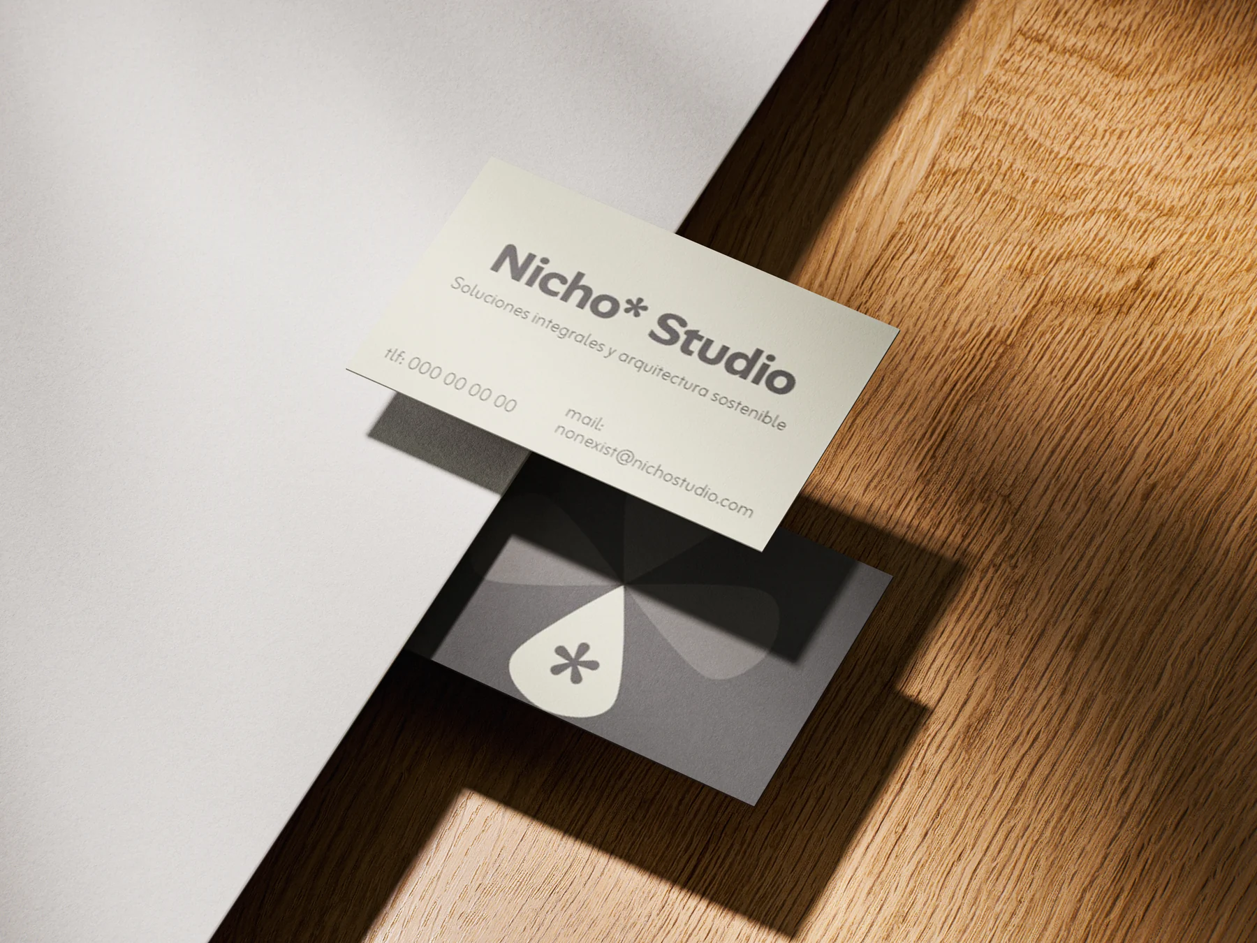
Nicho Studio

Visual identity and web design for an architecture and interior design studio

View more

02 · Identity · Web · Practice project · 2026

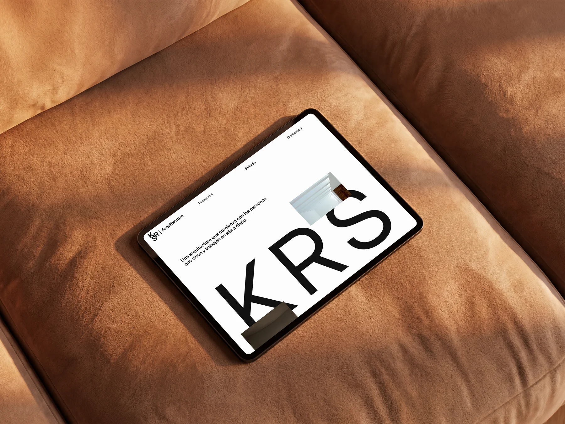
KRS Arq

A typographic identity and editorial website for an architecture studio

View more

03 · Identity · Web · 2026

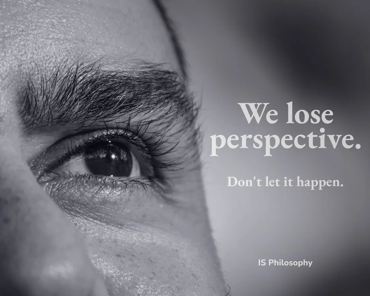
IS Philosophy

Identity and web for a philosophical consultancy

View more

04 · Poster · 2026

Vaia Fame

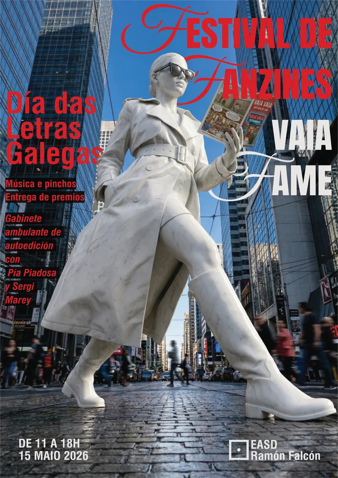
Poster proposal for the Día das Letras Galegas zine festival

View more

05 · Experiments

Explorations

Training work across very different media: trying, getting it wrong and trying again.

View more

06Software · In development

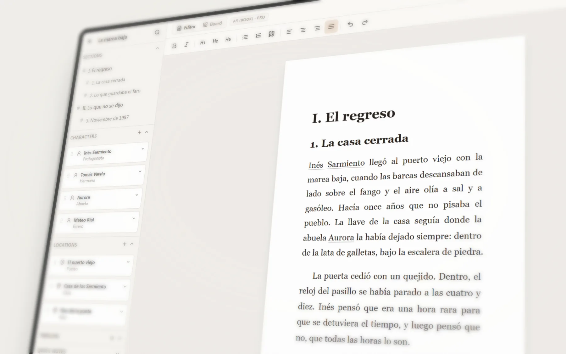
NarrativeOS

A writing environment that adapts to how writers think: it organises ideas, chapters and characters. No generative AI.

View more

07Software · Exploring

Coaki

Moving several projects forward without locking time into calendar cells: steady, alternating, healthy progress.
View more

  1. Nicho Studio: Visual identity and web design for an architecture and interior design studio

    01 · Identity · Web · Practice project · 2026

    Nicho Studio

    Visual identity and web design for an architecture and interior design studio

    View more
  2. KRS Arq: A typographic identity and editorial website for an architecture studio

    02 · Identity · Web · Practice project · 2026

    KRS Arq

    A typographic identity and editorial website for an architecture studio

    View more
  3. IS Philosophy: Identity and web for a philosophical consultancy

    03 · Identity · Web · 2026

    IS Philosophy

    Identity and web for a philosophical consultancy

    View more
  4. Vaia Fame: Poster proposal for the Día das Letras Galegas zine festival

    04 · Poster · 2026

    Vaia Fame

    Poster proposal for the Día das Letras Galegas zine festival

    View more
  5. Explorations: Training work across very different media: trying, getting it wrong and trying again.

    05 · Experiments

    Explorations

    Training work across very different media: trying, getting it wrong and trying again.

    View more
  6. NarrativeOS: A writing environment that adapts to how writers think: it organises ideas, chapters and characters. No generative AI.

    06Software · In development

    NarrativeOS

    A writing environment that adapts to how writers think: it organises ideas, chapters and characters. No generative AI.

    View more
  7. Coaki: Moving several projects forward without locking time into calendar cells: steady, alternating, healthy progress.
    07Software · Exploring

    Coaki

    Moving several projects forward without locking time into calendar cells: steady, alternating, healthy progress.
    View more

Nicho Studio

Visual identity and web design for an architecture and interior design studio

The case

Nicho Studio is a fictional identity and website for an architecture and interior design studio. There is no real client or live site. The photographs belong to the proposal and do not document projects by IS Margin.

The identity

The visual proposal reinforces the brand’s sense of closeness and commitment to sustainability through natural colours, cream and earth tones. We wanted to convey the social care behind each project and show that a distinct visual character can work efficiently without going unnoticed. The typography follows the same direction: it moves away from the minimalism and order commonly expected in the sector to build an identity that feels more approachable, human and real.

The website

We designed a concise but carefully considered navigation. The name itself is the starting point: Nicho places each project at the centre and seeks to convey the calm of feeling at home. The structure is clear and straightforward, with direct sections such as ‘The method’, where the brand explains its concerns and commitments. The result keeps a simple aesthetic that communicates the studio’s care, work and character.

Nicho Studio: Visual identity and web design for an architecture and interior design studio
Nicho Studio identity applied to a storefront mockup
Nicho Studio home page, a web design practice project with plant photography and a cream background
Expanded Nicho Studio menu with links and fictional project images
Nicho Studio project view with interior photography
Nicho Studio principles screen with cream typography on a dark olive background

KRS Arq

A typographic identity and editorial website for an architecture studio

The case

KRS Arq is a fictional identity and web design proposal for an architecture studio. It is not based on a real client and the website is not live. The material brings together two mockups to establish the brand’s visual character and show how it can work in practice, alongside four captures of the website design. The photographs are part of the proposal and do not document projects by IS Margin.

The approach

The direction for this fictional proposal begins with an architecture studio defined by its attention to detail, with a distinctive design centred on the interior as its guiding principle before extending outwards. It also works as an analogy for its potential clients: concern comes first, then the causes of the problem are identified; it is resolved from within, and only then does the process open up to creativity.

The website

As an aesthetic principle, architecture tends to favour hierarchy, order and minimalism. In this experiment we wanted to go further, using large-scale typography to create a sense of presence and photography selected carefully to convey care, warmth and approachability. In some parts of the page, both elements are arranged unevenly to break that canon.

KRS Arq: A typographic identity and editorial website for an architecture studio
KRS Arq name applied to a black pen
KRS Arq website home page
KRS Arq Studio page with the KRS monogram at large scale and an architectural photograph
KRS Arq projects page with filters and a grid of architectural photography
Continuation of the KRS Arq Studio page with an interior photograph and typographic manifesto

IS Philosophy

Identity and web for a philosophical consultancy

The brief

IS Philosophy is a philosophical consultancy: it helps people and teams think difficult decisions through with judgement, using its own five-phase method, LOGOS. It is a project we share with Jose Bonal: he brings the philosophical judgement and we bring the brand, the design and the website. The challenge was to present something unusual without sounding academic or like coaching.

How we approached it

We started with the voice before the image: what the brand is, what it is not and how it speaks. That led to a sober, direct tone, rooted in the European tradition written in Spanish (Heraclitus, Ortega, Machado) rather than guru one-liners. Visually, a deep slate blue, a muted sky blue and bone white, classical sculpture in the imagery and an editorial serif for headings and quotes.

Where it stands

The published website explains the method, separates its two audiences, organisations and individuals, and leads to contact. But a design is never truly finished: it gets refined, improved and polished until it really answers what the brand needs. All the more here: it was the studio’s first project and we remain part of it. Version 4 is under construction and adds a client area with courses and sessions.

IS Philosophy: Identity and web for a philosophical consultancy
IS Philosophy website home page: “Clarity is the new luxury”, next to a classical bust
IS Philosophy services in perspective: organisations, individuals and training, over classical sculpture in low light

Vaia Fame

Poster proposal for the Día das Letras Galegas zine festival

The brief

A competition for the poster of the Día das Letras Galegas zine festival at EASD Ramón Falcón. Before starting, we looked at the posters from previous editions and set out to do the opposite of going unnoticed: something striking, imposing and distinctive.

How we approached it

A marble statue crossing an avenue of skyscrapers while reading a zine: the classical and the self-published in a single gesture, at monumental scale. A script typeface next to a condensed grotesque, in red and white, so it reads from a distance. The figure and the background scene are AI-generated; we developed the idea, the composition, the typography and the colour.

How it ended

We didn’t end up submitting it. We keep it as a poster exercise: one strong image, a clear hierarchy and a piece you can recognise from afar.

Vaia Fame: Poster proposal for the Día das Letras Galegas zine festival
The Vaia Fame poster in perspective
Poster detail: the statue with the zine and the headline

Explorations

Training work across very different media: trying, getting it wrong and trying again.

What they are

Pieces in very different media: the image from David’s previous portfolio, a form created from flat planes, a pen-and-ink drawing of the Copenhagen Stock Exchange tower, a play of light and shadow with acrylic glass and the school logo, redrawn.

What they set out to do

They are not strict projects: there are no plans, no dimensions and no real measurements. Their purpose was different: to push us to create in different media and to discover ourselves as designers. To learn our strengths and weaknesses, how to reinforce them and how to move between disciplines, whichever they are.

What they taught

They taught us to break through the barrier of creating something new and the fear that can come with it. To try, get it wrong and try again. They don’t represent a commission, but they left us with something more.

Explorations: Training work across very different media: trying, getting it wrong and trying again.
Forma Metal: a form created from flat planes
Pen and ink: the Copenhagen Stock Exchange tower drawn with line hatching
Transparencies: light, shadow and blue tones with acrylic glass
The school logo redrawn, in negative: light shapes on black

NarrativeOS

A writing environment that adapts to how writers think: it organises ideas, chapters and characters. No generative AI.

The idea

It was born with David’s father in mind and with a specific problem: everything around a long text ends up in a mess. We started by researching how writers think and work, from novels and scripts to journalism and research, so that the tool adapts to their process and not the other way round.

How we’re approaching it

What they all share is the need to organise ideas. So there is a visual map to connect notes, characters and places, and a structure of chapters and sections to move around the text. For those who only want the page and a blinking cursor, an immersive mode hides everything else. Careful with the aesthetics and without AI: the tool organises, but it doesn’t write for you.

Where it stands

A desktop app in development. The chapter editor, the map, character and place cards, the timeline, the immersive mode and export already work. The screenshots use a sample novel.

NarrativeOS: A writing environment that adapts to how writers think: it organises ideas, chapters and characters. No generative AI.
NarrativeOS board: chapters connected to characters, places and notes
NarrativeOS character cards, one of them expanded
A NarrativeOS editor page in dark mode

Coaki

Moving several projects forward without locking time into calendar cells: steady, alternating, healthy progress.
The idea

Coaki is the latest idea we’ve started exploring, which is why there’s little to show for now. It comes from a concern: the habit of locking our time into calendar cells to meet an established idea of productivity. Every task with its slot, every gap filled and the feeling of always running late.

How we’re approaching it

By unlinking progress from those cells. The project is the unit of work, and progress is measured by what moves forward, not by the hours booked: steady, alternating, healthy and fruitful. Dates don’t disappear: they stay for the commitments that really are commitments, like a deadline or an appointment.

Where it stands

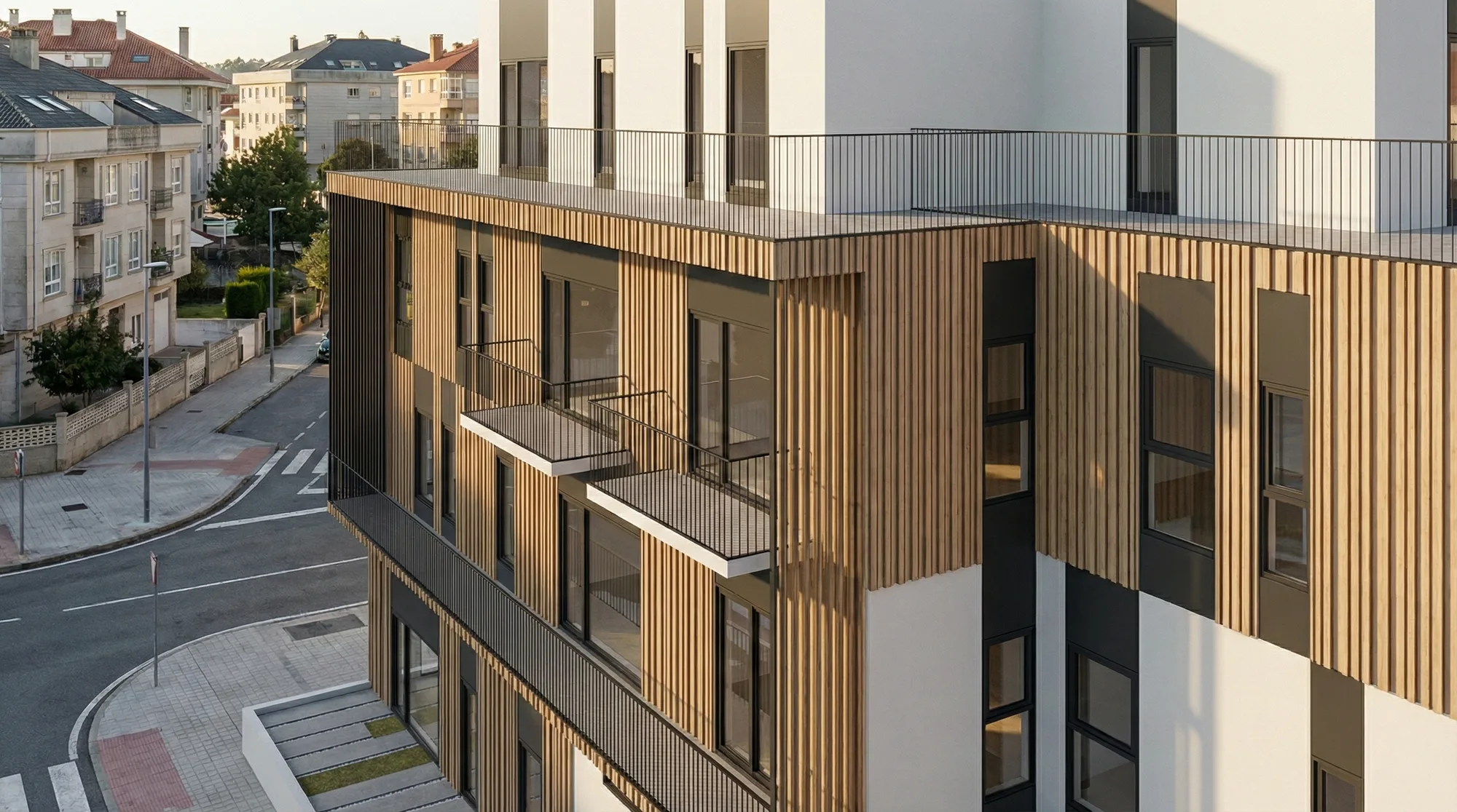
Somewhere between the idea and a first prototype. Before showing screens, we want to be clear about its purpose and use it every day. For now, what’s on show is its icon.

Coaki: Moving several projects forward without locking time into calendar cells: steady, alternating, healthy progress.